In the modern business world, data is playing a vital role for analysis and prediction of business results, consequent visualization is important for all business users as it provides user friendly results. However, everyone knows a little bit about visualization as the term self-explainer. In modern business, visualization finds wide use in a variety of perspectives.
According to Wikipedia:
Visualization or visualisation is any technique for creating images, diagrams, or animations to communicate a message. Visualization through visual imagery has been an effective way to communicate both abstract and concrete ideas since the dawn of humanity.
Similarly, data visualization uses visual data representation to communicate information in a universal, fast, and effective form. Scatter data does not represent any value to the business as well as it requires high skill to understand each user but data visualization helps in presenting the data effectively and provides highly analyzed .
Data visualization and analysis in model-driven apps enables us to graphically visualize and analyze data for our business, and help us gain quick insights to make important business decisions. Below components provide the data visualization in the Model Driven App.
- Charts: Charts are individual graphical visualizations that can appear in a view or form, or that can be added to a dashboard.
- Dashboards: Dashboards show one or more graphical visualizations that provide an overview of actionable business data.
- Embedded Microsoft Power BI: Power BI adds embedded Power BI tiles and dashboards to apps. Power BI is a cloud-based service that provides business intelligence (BI) insights.
Charts:
Charts provide an interactive view of the data that provides a more holistic understanding of the data, so that business users can make decisions or review the progress of the business process.
In model driven app, charts are distinguished into different types, series wise, there are two types:
Single-Series Charts: Charts that display data with a series (y) value mapped to a category (x) value.
Multi-Series Charts: Display data with multiples series values mapped to a single category values.
According to the data behavior, charts are also divided into two different types:
Personal charts: Such charts are created by users, they are more specific to user roles.
System charts: System charts are solution components that can be created using them only with permission to customize the system. Such charts are created by the system customizer or administrator and are available to all users of the system.
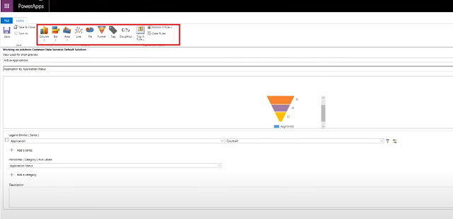
According to the graphic representation, one can create the following types of charts in a model driven app:
- Columns
- Bar
- Area
- Line
- Pie
- Funnel
- Tag
- Doughnut
Dashboard:
Dashboard is the user interface where business users can monitor multiple activities at one place. They are used to show multiple areas of an application in a single display. They are useful tools for showing an overview of the amount of activities and process status of an items requiring attention.
There are two types of dashboard:
User Dashboard: A user can choose to set their user dashboard as their default dashboard and override the system dashboard.
System Dashboard: An Administrator or Customizer creates or customize dashboards the when publish are visible to everyone in the organization.
While all dashboards in a model driven app are interactive, the interactive experience dashboard can be a one stop place for app users who act as sales reps or service reps to view workload information and take action.
There are two types of interactive experience dashboards :
- Multi-Stream
- Single-Stream
Multi-Stream:
Multi-stream dashboards display data in real time across multiple data streams. Although there is no limit on how many streams we can configure on the dashboard. The data in a stream can be based on only one entity, but each stream can be based on a different entity.
Single-Stream:
The Single Stream Dashboard displays real time data on a stream based on an entity view or queue.
Dashboard Components :
- Charts
- Lists (based on views)
- Iframes
- Web Resources
- Social insights
- Relationship Assistant
- Organization insight
Embedded Microsoft Power BI:
Microsoft Power BI is one of powerful analytical tool in the world and Business User can easily embedded Power BI into Model driven apps.
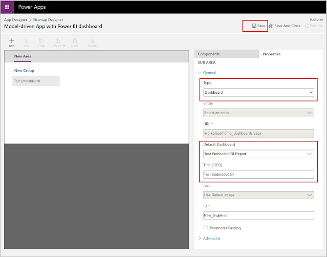
Power BI dashboards can appear only on personal dashboards and embed Power BI visualizations can be embedded only on personal dashboards. Therefore, admins can't create system dashboards that include Power BI items and that are visible to the whole organization.
Because Power BI connects to Dynamics 365 and part of the application, there are some limitations that you should consider when you're deciding whether to use Power BI:
- Power BI doesn't run in the context of records or users: Unlike charts and dashboards, Power BI doesn't run in the context of a record or user. Although the functionality can be extended so that it includes links to individual records, this capability isn't available natively.
- Data updates occur hourly or daily: Power BI doesn't show a real-time view of Dynamics 365 data. The data is updated at specific intervals that depend on your pricing tier.
- The application and service are separate: Power BI is a separate application that connects to Dynamics 365 data. It might require other licensing in addition to your Dynamics 365 licensing.
we can follow this
link to embedded the Microsoft Power BI.


Comments
Post a Comment